St. Paul Craftsman House gets a Stylish Modern Kitchen!
After purchasing a new home in St. Paul, this young couple came to us in need of help redesigning their odd mess of stairways, doorways, and lack of access to their kitchen. In addition to creating a stylish kitchen that pays better tribute to the rest of the beautiful woodwork in the house. What we ended up with was a beautiful contemporary and playful space that will serve their growing family for years!
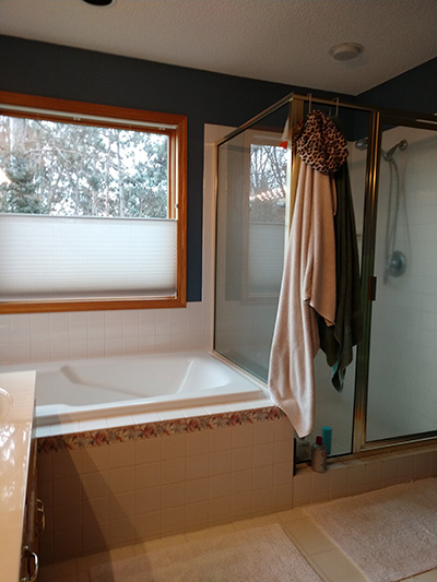
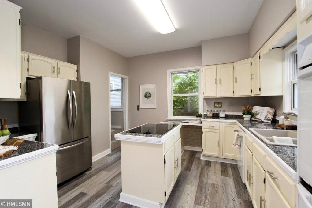
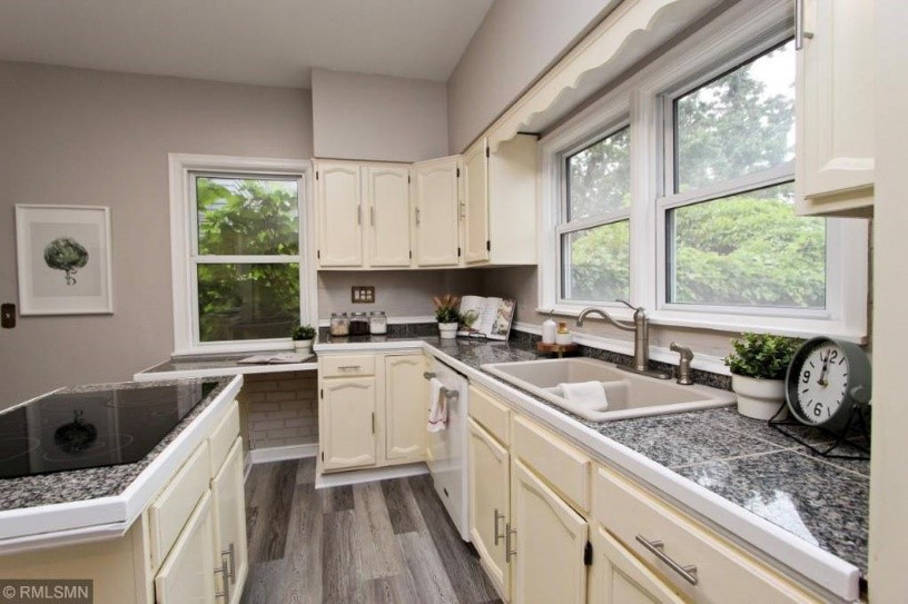
Some BEFORE pictures:
The side window (smaller one) in the picture shown was removed so we could make room for the stove, hood, and a more functional run of cabinets. Although it’s green out there, the window doesn’t look out onto much other than the side of the neighbors’ house. So away it goes.
Some CONSTRUCTION plans:
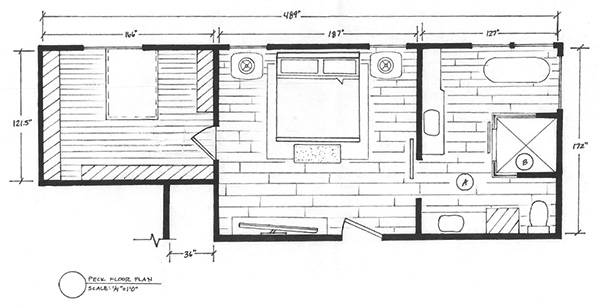
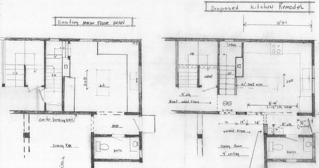
A rough drawing of the changes to the doorways and floor plans. We created a hallway from the foyer and main stairs up (coming from left), and opened up the wall between the kitchen and dining room as much as we could, considering the in-floor radiant heat throughout the house. Mechanicals can be a tricky thing when removing or moving walls, and this old house was no exception. Although we only altered a foot here and there with these walls, it made a huge difference in the sight lines and connectedness of the kitchen to the rest of the house.
Some FINISHED pictures:
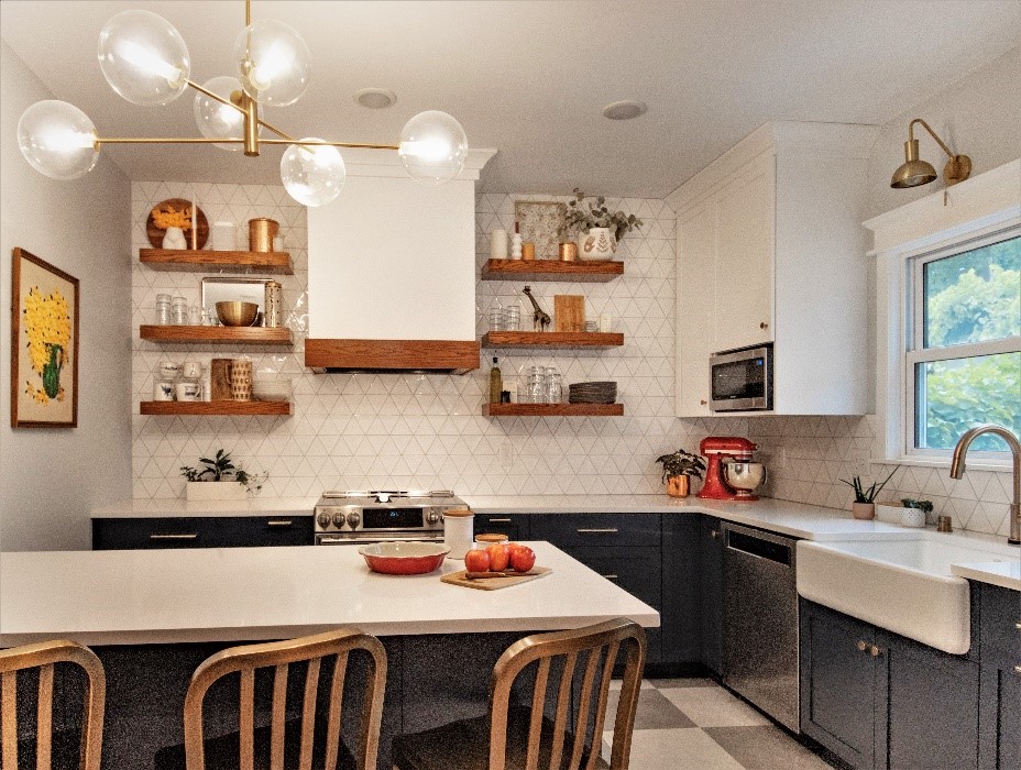
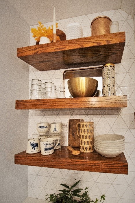
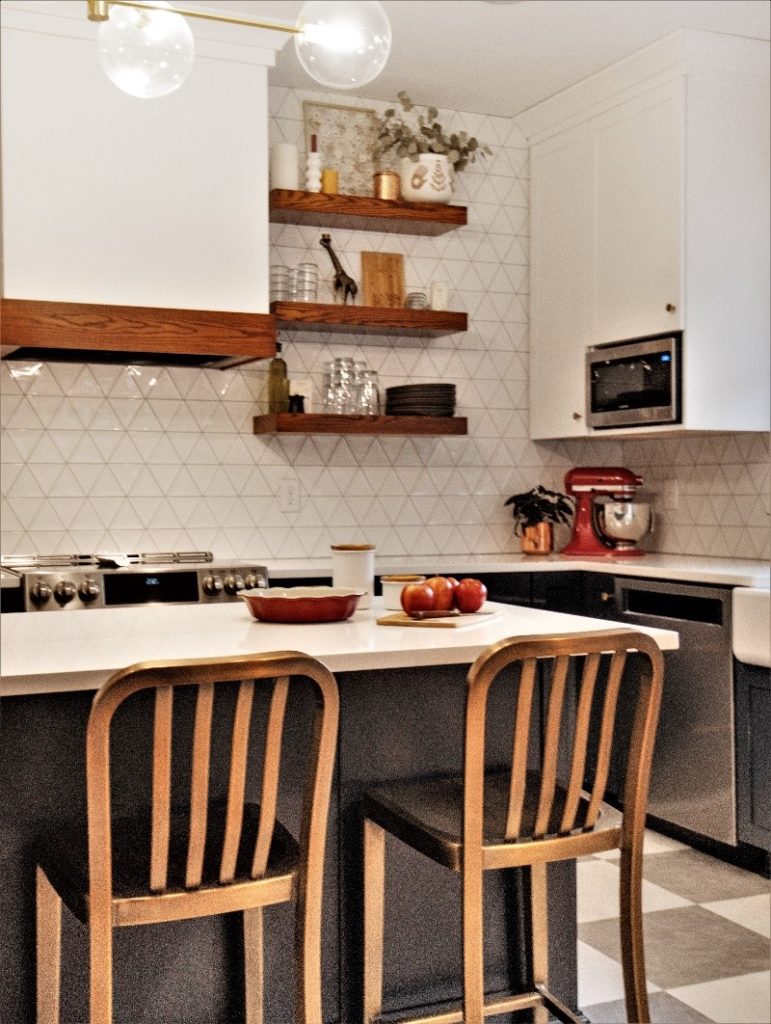
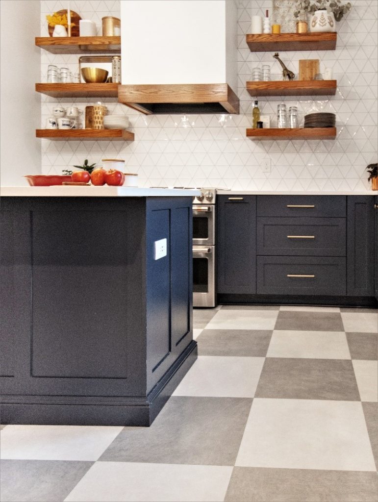
The result of some bravery in design details, like open shelves and a big peninsula instead of a small island, resulted in a beautiful space that makes the kitchen feel way bigger than it actually is. Red oak accents on the hood and shelves tie in the kitchen with the woodwork in the rest of the house, and the navy cabinets and checkered floor make this kitchen look like it was original when the house was built! Contemporary finishes on the lighting, furniture, tile work, and fixtures give this space a modern midcentury vibe that that is both functional and playful.
A lone POWDER BATH picture:
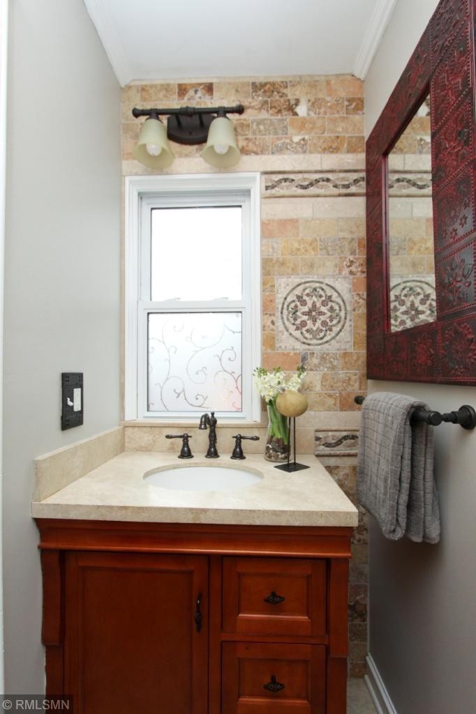
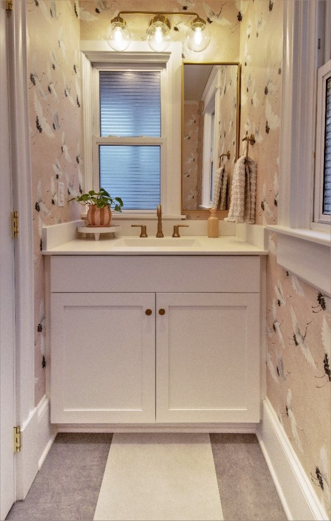
We’ll throw this one in for fun – a quick cosmetic update that made a major impact (although we have to admit the tile work in the powder bath is something amazing). BEFORE picture on the left, AFTER picture on the right (you may have seen this on our Instagram from January). We still can’t get over how beautiful that wallpaper is!
Those construction plans from above? This is the powder bath shown on the bottom right.
